Announcement

Collapse
No announcement yet.

Rejection opinions

Collapse
X
 
  • Filter
  • Time
  • Show
Clear All
new posts

  • Rejection opinions

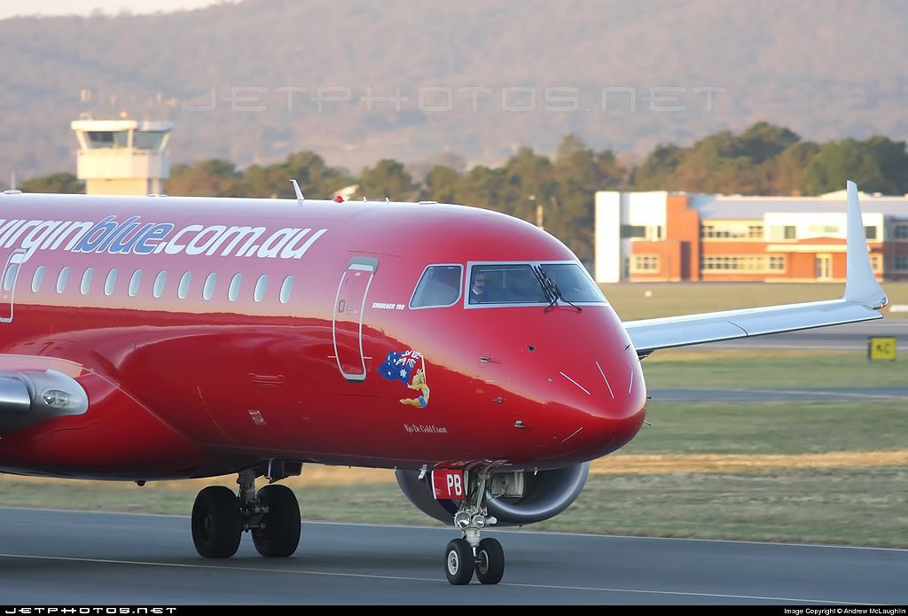
    Got this rejected the other day...


    ...I can't see where it's undersharpened nor where it's dark and underexposed.

    Detail is clearly visible on the fuselage and the reflections on the fuselage side show the wing and the sunset. The main focus is the flight deck windows which are virtually dead-centre of the pic, while still showing the winglet and enough background to make the shot interesting.

    I was really disappointed to get this rejected as I was particularly pleased with the result I was trying to achieve.

    Any feedback would be appreciated.

    Cheers & Merry Christmas

    Andrew


  • #2
    I'd go for smoething like this

    The winglet doesn't add much from that angle, but that's perhaps more a personal opinion.

    The photo definitely lacks contrast and is very soft. I used sharpening settings on this photo, which I never use on any of my photos!

    EDIT: the original photo seems to be severly soft/blurry/out of focus.
    Last edited by LX-A343; 2010-06-12, 06:45.
    My photos on Flickr www.flickr.com/photos/geridominguez

    Comment


    • #3
      Nice photo/reflections Andrew.
      I think you had some bad luck with a cloud because the background has a lot of light,but the screeners are right here. Your levels are fine but you need to adjust the curves. (that large peak has to move to the right, add some contrast maight be useful.)
      Scharpening is often an overall thing that you will have to by eye. It could use 2 or 3 or even more kicks of Unscharp Mask

      To make it visable

      Comment


      • #4
        There is some more that can be done. The left side of the histogram can be adjusted to bring the dark tone arrow to the base of the graph. I set the grey point to the centre of the nosewheel tyre which richened the colour and gave it 5 passes overall of USM at 50_0.2_0 The "Embraer 190" title and the nose art could probably do with a couple more passes of selective USM as well.

        ...and I agree with Gerardo about the wing. It leads the eye out of the image. Better to crop closer.

        Last edited by brianw999; 2008-12-26, 11:20. Reason: added text.
        If it 'ain't broken........ Don't try to mend it !

        Comment


        • #5
          Originally posted by LX-A343 View Post
          The winglet doesn't add much from that angle, but that's perhaps more a personal opinion.
          This I have to agree entirely with. Compositionally the wing right out there to the right of the frame doesn't really seem to need to be there, and it creates a lot of dead space which for me personally isn't really all that visually appealing. The example Gerardo gives is much more focussed.

          A couple of other things I notice about this photo is technically it's actually over-exposed. If you look at the histogram you see the white buildings in the background are actually blown out, making the aircraft appear quite backlit to my eyes. If you gently burn these buildings in, the line at 255 on the histogram disappears. The problem here is it will be very difficult to burn those in, brighten the overall image afterwards and still end up with a natural looking shot. In all truth it's probably far more hassle than it's worth.

          Secondly, it is indeed very soft but you've uploaded it at 1600 pixels wide. There's a huge difference in editing images 1024 wide and 1600 wide. 1024 wide can hide flaws tat 1600 wide shows up very, very clearly. Not only is the image itself bigger at 1600 wide, but so are all its inperfections and unless you have an absolutely pin sharp image to start with from the camera, you don't have a hope in hell of making it pin sharp at 1600 wide.

          As an example, here's your original image re-sized to 1024 wide with sharpening (a lot of sharpening!) applied.


          That was one pass of USM at 100%, radius 0.3, threashold 0, and a second pass at 80%. That's an immense amount of sharpening and it's just starting to show very faint signs of being oversharpened in the nosegear but the titles are still a little soft. That said, by comparison to the 1600 wide version it actually looks reasonably sharp.

          My honest opinion on this shot is that with the highlight burning, sharpening and general contrast adjustments this shot needs, it would be too much hassle to get it to an uploadable standard. Sometimes a shot can be quite nice but just needs too much correction to make it 'technically right'. Only an opinion though, of course!

          Paul
          Last edited by PMN; 2008-12-26, 11:31.
          Seeing the world with a 3:2 aspect ratio...

          My images on Flickr

          Comment


          • #6
            Thanks guys

            There's been a fair bit of inconsistency in what's been accepted recently so I guess I was hoping for a break.

            How about this version, taken a couple of frames later?


            Cheers

            Comment


            • #7
              Like that second one much better.

              Comment


              • #8
                ^^^

                Second that comment. Much better.
                If it 'ain't broken........ Don't try to mend it !

                Comment

                Working...
                X