Announcement

Collapse
No announcement yet.

Prevent "too little or too much contrast" rejections

Collapse
X
 
  • Filter
  • Time
  • Show
Clear All
new posts

  • Prevent "too little or too much contrast" rejections

    Hello,

    After several people in the forum helped me with my questions about how to prevent soft rejections, I have had much succes in that.
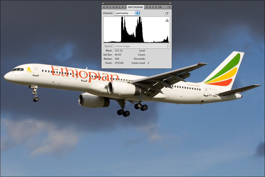
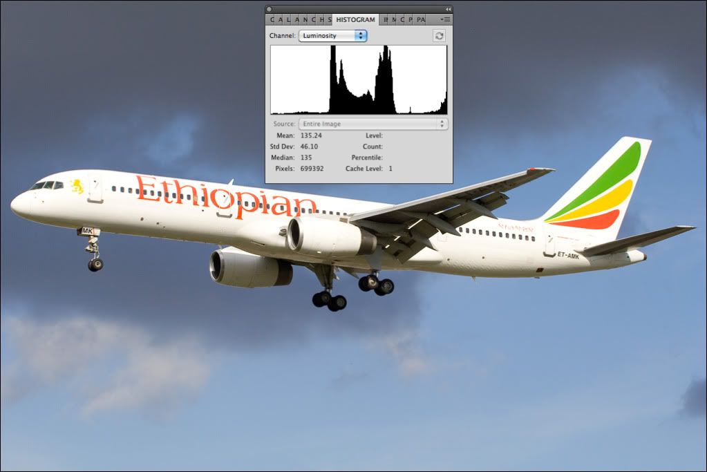
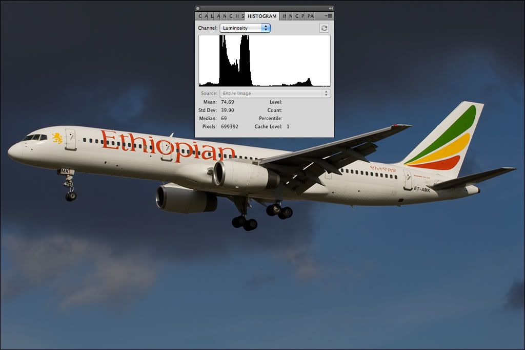
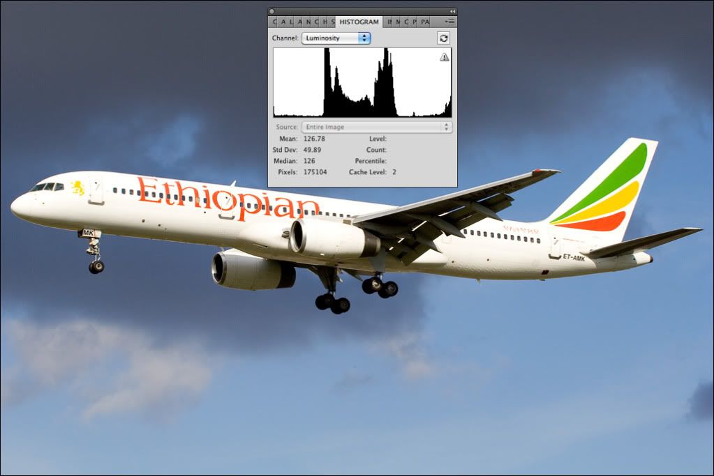
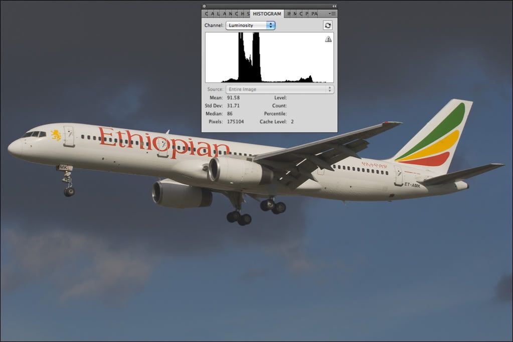
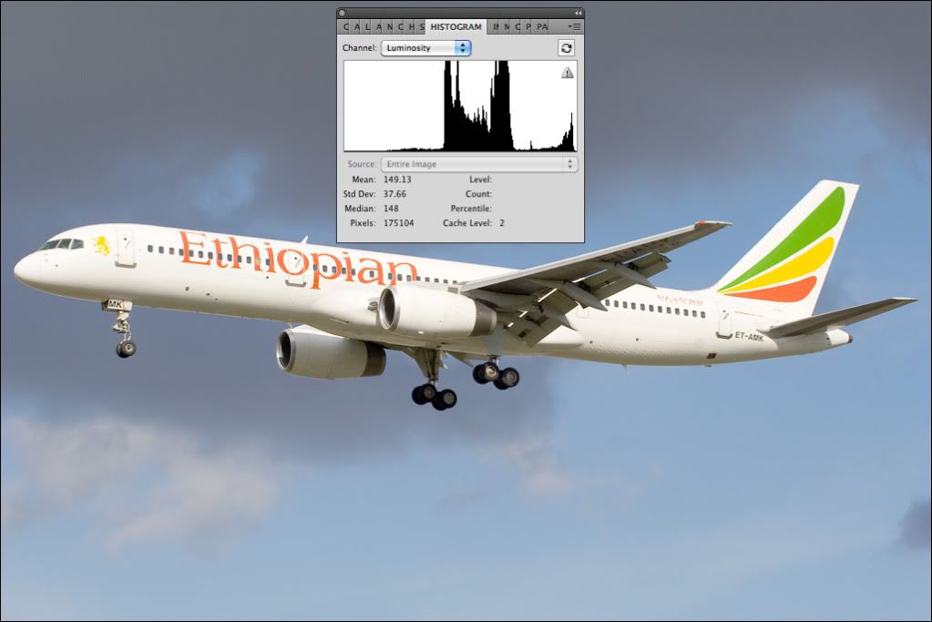
    More recently my rejections were due to a dirty sensor (had it cleaned yesterday), and due to "too little or too much contrast".

    So far I have calibrated my screen with a spider express.
    Other than that, I am a bit confused about the rejections.
    I would like to know the following:

    - too much contrast?
    - too little contract?
    - how can I improve the image in question?
    - how can I prevent it.

    I think with answers to my questions I will learn a lot (again) and I can improve my images.

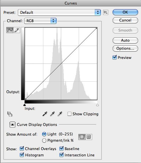
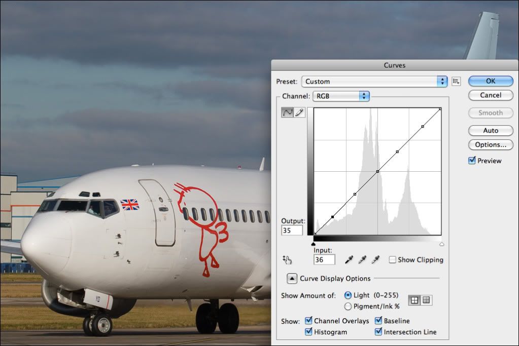
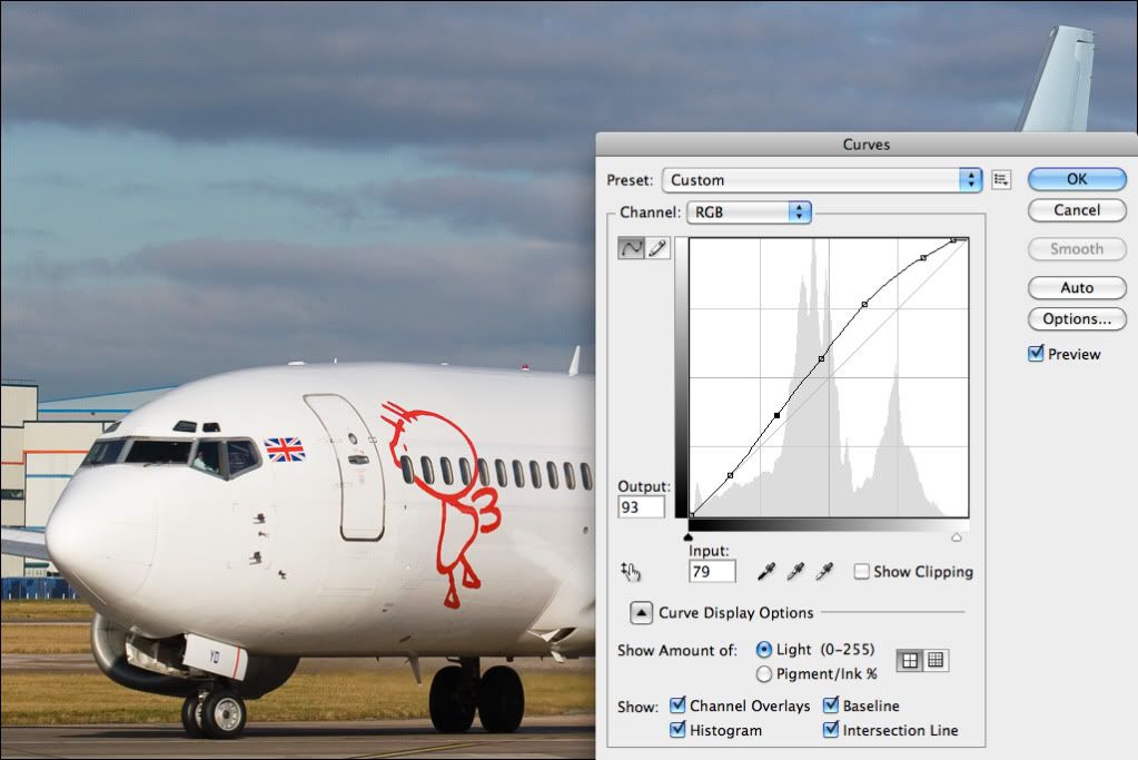
    On a side note I would also like to learn a bit about 'curves'.
    What are they, and how are they correctly applied?

    I know it's quite a list (that's why I am asking, as for me it seems like a recurring 'symptom'), but the images in question I would like to learn from are:


    Thanks in advance again for your help!

    Regards,

    Derice.
    Last edited by Derice; 2010-06-06, 13:10.
    My Travels across the globe
    Pictures I am proud of


  • #2
    I have to be honest, your recent rather blunt emails to the screening team regarding rejections have kind of put me off writing a lengthy reply here. How does this sound? I'll spend an hour or two (probably tomorrow as I'm out and about at the moment) writing a little tutorial and try help and you quit the blunt two word emails. Sound fair?
    Seeing the world with a 3:2 aspect ratio...

    My images on Flickr

    Comment


    • #3
      Originally posted by PMN View Post
      I have to be honest, your recent rather blunt emails to the screening team regarding rejections have kind of put me off writing a lengthy reply here. How does this sound? I'll spend an hour or two (probably tomorrow as I'm out and about at the moment) writing a little tutorial and try help and you quit the blunt two word emails. Sound fair?
      Thank you for your honesty.
      I'm sorry that you feel my e-mail was blunt. I certenly didn't intend it that way. My sincerest apologies. I most certenly don't want anyone to feel offended in anyway.
      I do think I put a bit too much frustration in my mail, again sorry to anyone in the team who feels offended by me, not my intention.
      It won't happen again. I just want to understand the whole contast reason. I'm a bit of a perfectionist if it comes to myself.

      In retrospect: I had my screen calibrated and my sensor cleaned last week.

      The tips you guys gave me on soft rejections really helped, I don't think I received a soft rejection ever I applied those tips. That's why I really would love to hear about contrast tips, as I believe I can succesfully apply those tips as well (what ever they will be).
      I hope my thanks for the 'soft' tips did reach everyone (did post them in the other topic). I certainly appreaciate the help here.

      So yes, it sounds fair and I have taken notice of what you wrote here.
      Lets see this as a false start ok?
      My Travels across the globe
      Pictures I am proud of

      Comment


      • #4
        No problems at all, apology accepted and thankyou for such a genuine reply. I'll spend a bit of time tomorrow writing a little tutorial explaining things like using histograms that will hopefully help.
        Seeing the world with a 3:2 aspect ratio...

        My images on Flickr

        Comment


        • #5
          No problem.
          I felt really bad about your message.

          I'm looking forward to the tutorial!
          My Travels across the globe
          Pictures I am proud of

          Comment


          • #6
            Honestly, don't feel bad. It really is fine. I'll get this thing written and we'll see if we can get to the bottom of whatever problems you're having.
            Seeing the world with a 3:2 aspect ratio...

            My images on Flickr

            Comment


            • #7
              Ok, thanks!
              My Travels across the globe
              Pictures I am proud of

              Comment


              • #8
                Hookay… Here we go! I think it will be easier if I use the same photo to show what the rejection reasons look like, then hopefully you can apply what's discussed here to the images you list above rather than go through them all individually.

                We'll start with what contrast actually is. Your camera has a dynamic range, which is basically the difference between the darkest and lightest tones it can register. We can split those tones up into three main groups; shadows, mid tones and highlights. Contrast is essentially how these three basic groups of tones are balanced relative to each other. Any imbalance of them can lead to a contrast rejection, so the trick to avoiding this is to firstly learn to read the tools available in processing software and then to train your eye to recognise when things are slightly wrong. It's been pointed out in the past that the contrast rejection can be a little vague; there may be an element of truth in that at times, but there's a wonderful tool freely available to help with diagnosing the problem: the histogram, and it's this tool we'll look at in some detail here.

                Have you ever seen spectrum analysers on hi-fi systems, the bars of LED's that bounce up and down according to the pitch of the sound being played? The bass is to the left, mid tones in the centre and treble to the right. Hit a bass drum and the bars in the bass end to the left shoot up. Hit a cymbal and the bars in the treble end to the right shoot up. The further they shoot up, the louder the sound. The histogram does precisely the same thing, but instead of reading sound it reads the brightness information in your digital image. The shadows are to the left (black being at the very left edge), mid tones in the centre and highlights to the right (white being at the very right edge and the three groups being a direct visual equivalent of bass, mid and treble). The higher the peaks are, the more pixels are giving that level of brightness.

                Here's what the histogram looks like on a photo, and it's this same photo we'll use for the example of what the main contrast rejection reasons actually look like:


                Looking at the photo you can see the brightest thing is the white fuselage, then the next large area of uniform brightness is the blue sky in the lower half of the frame. The bright fuselage shows itself as the little peak to the right of the histogram in the highlights, the blue sky below is the central peak merging with the darker clouds in the mid tones and the darkest areas like the tyres are showing as the tiny peaks of information to the left. It's extremely important to remember that there's no such thing as a 'perfect' histogram, but there are certain things to look out for that can guide you with contrast. The exposure in this image is pretty much perfect; the conditions and light were superb and we can see the full range of tones right from the very darkest shadows up to the brightest highlights are present, so we're using the full dynamic range available to us without pushing any part of it too much. As we've started with pretty much a perfect exposure and we know what the histogram looks like, we can now alter the exposure and see the effects this has on the histogram. I'll explain the rejection reasons each image would generally be given and the reasons for that as we go along.

                In the first example, we'll look at a classic 'overexposed' rejection:


                The exposure here is pushed by half a stop from the previous correctly exposed version. The highlights are now starting to look too bright and are starting to lack detail, the sky is starting to look slightly washed out and we can see the histogram now has a large peak to the right side. The shadow detail is still there, but the image now looks wrong because the balance of the three groups mentioned earlier has been changed too much, and as a consequence the image is overexposed. Because the shadow detail is still OK but the highlights are pushed too much, this would tend to be rejected for being overexposed rather than having too much contrast.

                Next, a classic 'underexposed' reject:


                We're now a stop darker than the correct exposure. The fuselage is looking dull and lifeless; it doesn't jump out of the screen anymore and generally looks much less interesting than the original. The clouds are darker and we generally see less tonal detail. The effect of darkening is very clearly seen in the histogram, and if you only saw the histogram and not the actual photo you could still tell you're dealing with a dark image. Brightening in processing can lead to problems like increased levels of noise, but it's usually possible to brighten by a stop if you're shooting at lower ISO's without the effects being too negative. Because the problem here is a very definite lack of information up at the top end in the highlights, this would tend to get an underexposed reject.

                So far the two examples we've seen wouldn't have generally been rejected for contrast. While the contrast is technically higher in the overexposed example and lower in the underexposed example, neither would actually be rejected for contrast. As explained earlier contrast is a balance of shadows, mid tones and highlights, and the examples so far have shown the effects when we push or pull all three one way or the other leading to two very distinct flaws (under and over exposure), and we've also seen how these effects are displayed by the histogram.

                We'll now look at some examples of classic contrast rejections, starting with too much contrast.


                If the exposure is incorrectly set then the camera will generally give results like we see in the first two examples; either under or over exposed. The example we see here is usually caused by overdo-ing things when processing and pushing the shadows and highlights too much. We can see the fuselage is too bright and the shadow areas under the wings look slightly too pronounced and unnatural. We see the effects of this in the histogram; the overexposure is evident by the large peak to the right and we can see a line making its way up the left side, showing a lot of pixels are black. Pure black and pure white are generally really quite bad things to have in a digital image, and it's important to understand that's purely a fact dictated by the technical limits of digital as a medium. When shooting colour print film the white parts of the photo are formed by the actual paper you print on, and as such a degree of overexposure can look quite nice because it's kind of natural. In digital imaging, white is produced by all three elements that make up a pixel (red, green and blue) giving their full output, so if your image contains pure white then you're actually technically overexposing. To use another audio analogy, you know when you hear some fool with his car stereo up way too loud and it distorts and sounds horrendous? The distortion you hear is called 'clipping'. It occurs because you're trying to ask the amplifier to output more power than it's being supplied with, and when this occurs it 'clips' the top and bottom of the wave when the limit of its power supply is reached. Overexposing a digital image is also sometimes referred to as clipping and in essence you're doing the same thing; you're pushing the pixel to the limit of what it's capable of outputting, so next time you see that little peak to the right of the histogram just think of shitty sounding car stereos... It's just as bad! So again, this example has its shadows and highlights both pushed too far, and is a classic 'too much contrast' rejection.


                Next, too little contrast.


                Here both the shadows and highlights are lacking, leading to a somewhat dull and 'washed out' looking image. Great tell-tale signs the shadows are lacking are the tyres; they should normally appear quite black in photos (as they're black in real life), and we can see in this example they appear more as a shade of dark grey. Again, our trusty histogram shows us this is happening without even looking at the actual photo. In the correctly exposed original the information touched the left side of the histogram, meaning we had information right the way down to the darkest shadows while not having too much of them. Here the information doesn't touch the left side at all, showing there's actually no information in the darkest tones whatsoever. We also see hardly any information to the right side, showing there's a lot of room for it to be brightened.


                Hopefully so far this is making some kind of vague sense (it's 00:07 right now and I've had quite a lot of coffee today, so I may not be writing it as clear as I could be!) To recap what we've seen so far, we've seen the effects when we shift the overall brightness of a photo leading to under or over exposure, we've seen the effect of pushing both the highlights and shadows too far leading to too much contrast and we've also seen the effects of the shadows and highlights not being bold enough, leading to too little contrast. The principle effects we've seen so far have actually been dictated by the shadows, the highlights, or both, so for our next trick we'll look at a couple of examples of what happens when we screw with the mid tones!

                Again, contrast is balance; upset the balance and you upset how the photo looks. In this example the shadow and highlight details seem fine, both sides of the histogram are being touched so we have the full range of tones but the photo looks washed out. Comparing to the original, we can see the mid tones have shifted further to the right leaving hardly any information in the lower mid tones or shadows. This isn't really a case of too much or too little contrast, it's more a case of 'screwed up' contrast but the histogram is giving us a good indication something's possibly awry by showing the vast majority of the information in the photo is concentrated into the right half; it's imbalanced, and we can see this imbalance in the photo.


                Now, we do the reverse and darken the mid tones:


                The shape of that large central peak hasn't really changed shape because the tones are still the similar relative to each other, but the whole thing has now shifted to the left towards the shadows. We can see the highlight information is still present, but because the balance has been messed with the photo now looks unnatural. Most of the information is now in the darker part of the image, so regardless of the fact we still have plenty of highlight detail the image now looks dark overall. Again, not really too much or too little contrast, more 'wrong' contrast.

                To round up the examples, we've seen:

                Example 1 - Overexposed

                Example 2 - Underexposed

                Example 3 - Too Much Contrast

                Example 4 - Too Little Contrast

                Example 5 - Midtones Too Bright

                Example 6 - Midtones Too Dull


                Bear in mind that every photo is different and as mentioned earlier there isn't really a 'perfect' histogram, but the example I've used here is a classic good weather shot so the effects of what happens when we mess with the all important balance can clearly be seen. What these examples show us is how the various aspects of contrast look both on the actual photo and also on the histogram when they're adjusted, so now we know what they look like we can look into methods of correcting them and techniques for avoiding them in the first place.

                The first example, overexposed, isn't usually recoverable. As explained earlier, when we overexpose we push the pixel to its technical limit and nothing beyond that limit can be recorded, so we 'clip' or waste the information beyond the point where overexposure occurs. Darkening an overexposed photo typically leads to a very unnatural look, so quite simply the trick here is to avoid overexposure in the first place by keeping a very close eye on your cameras histogram as you're shooting. If you see the highlights starting to clip, dial in as much negative exposure compensation as is required to bring the information back to a point where it sits comfortably without forming a vertical line up the right side. This can take a little practice, but as with everything, perseverance will pay off in the end.

                The second example, underexposed, is easily correctable as long as it isn't drastically underexposed. Let's take this example:


                We can see the shadow detail looks fine on the histogram and also looks fine on the photo, but the mid tones and highlights are a little dark so we need to leave the shadows where they are and only adjust the mids and highlights. As you mentioned curves we'll use that to make the adjustments, so let's acquaint ourselves with this wonderful little tool:


                The name 'Curves' comes from the fact that this tool applies a tonal 'curve' to your image. Along the lower edge we have input and along the left edge we have output, both have a graduated grey scale indicator and essentially if we grab, say, the centre of the curve and move it upwards, the tone you see along the lower scale becomes the tone you see along the left scale, so moving that mid point down darkens and moving it up brightens. As with the histogram, dark tones are to the left, mid tones in the middle and highlights to the right (note the light grey histogram in the background), so to use this tool we'll start by plotting five roughly equal points along the line, so we have this:


                We can now tonally adjust any part of the image we like. In this case we want to leave the shadows unchanged and just adjust the mid tones and highlights so we leave the first point alone and gently push the rest of the points up, taking those tones that are a little too dark and making them brighter. In this one simple stage we've transformed a dull, lifeless photo into a vibrant and clear image.


                The next example is another very typical candidate for a rejection due to too little contrast. We can see the shadow detail is lacking and it's generally quite dull, so we want to darken the shadows and brighten the highlights:


                Applying a gentle 's-curve' achieves just that. The shadows become bolder, the mid tones and highlights become more punchy, the colours improve and the image generally becomes more dynamic:


                I'll make that the last example as from those you should be able to figure out how to, for example, darken mid tones by dragging the curve down rather than up. Just remember, overexposure isn't really generally recoverable so don't spend too much time trying to correct it, rather learn to avoid overexposure when you shoot. We can see Curves is an extremely powerful tool that can dramatically alter your photo, but you have to be aware that excessive use of any editing tool will have a detrimental effect. Editing pulls information apart or pushes it together, and in an 8 bit JPEG image there isn't a great amount of information to start with so you really want to be getting the exposure as good as possible when you take the photo rather than relying on editing too much. If you do use Curves, try keep the curve as smooth and as gentle as you can as excessive use can lead to compression artefacts like posterizing.


                Hopefully these examples have helped show what the contrast-related rejection reasons actually look like, how to spot them and basically how to use Curves to correct them, and if all of this has made some kind of vague sense then the best thing to do is simply to fiddle around and practice editing as much as you can. I'm a sad git; I've spent literally thousands of hours over the last 6 years with my head in Photoshop messing around and learning by screwing things up, and fiddling really is the best way of getting your head around all this so try spend as much time as possible experimenting based on the things I've outlined here. Rejections are annoying, there's no doubt about it and the kind of things I've gone into here can take a hell of a lot of time to really grasp but believe me, in time you'll be doing these things naturally while looking back wondering why you were ever having a problem in the first place.

                Anyway, it's now 03:01 and my hour or two writing this has turned into more like 4 hours, so it's time to sleep! Hope that helped. I'll have another proof-read of it tomorrow when I'm slightly more alert and see if I can re-word anything that might not make sense!
                Last edited by PMN; 2010-06-07, 09:23.
                Seeing the world with a 3:2 aspect ratio...

                My images on Flickr

                Comment


                • #9
                  That's incredible, Paul. Thank you!
                  Trump is an idiot!
                  Vote Democrats!!

                  Comment


                  • #10
                    Holy cr...!
                    That's a very extensive tutorial!
                    I'm at work now, but I will most certainly read all of this tonight!

                    I'm sure that many others will benefit of this information as well!
                    Thank you very very much Paul!

                    -edit-
                    Hi Paul,

                    I've just finished reading it for the second time.
                    It's really interesting stuff! Lots of usefull information, especially on how to correctly read the histogram.
                    You've written a clear tutorial, good examples and I believe I (and others) can really benefit from all of this information!

                    I will probably read it a 4th and 5th time (or maybe more) to take all of it in (too much for me to take it in all at once), and will start to play around it with some of my rejections and maybe some new uploads as well. I'll post some results when I am ready.
                    What's become clear for me now is, that there is much more to editing than I was/am aware of. And as you stated, the less editing is required, the better!

                    You're probably right that when I have gotten the hang of it, I will look back at these issues and thinking "what the hell was I making a fuzz about". I already have that reagarding the "soft" rejections. Really simple to prevent them (if the image isn't out of focus, or anything like that).
                    But that's a nice goal to aim for, pushing myself forward.

                    Thanks so far!
                    Last edited by Derice; 2010-06-07, 20:33. Reason: Comment after reading the tutorial.
                    My Travels across the globe
                    Pictures I am proud of

                    Comment


                    • #11
                      It certainly is a lot to take in at once and this is an 'edited down' version; I had to cut quite a lot of what I wrote out just to try keep it down to a reasonably manageable size! It won't all make sense immediately but not many technical-ish things in photography do. Making it all work practically comes with experience but as I say, fiddling is the best way of getting that experience and it will come in time, so don't worry too much if it doesn't all fit into place straight away.

                      Feel free to give me a shout if there's anything I can clarify further.
                      Seeing the world with a 3:2 aspect ratio...

                      My images on Flickr

                      Comment


                      • #12
                        Paul....

                        BLOODY......WELL.. ....DONE !

                        If it 'ain't broken........ Don't try to mend it !

                        Comment


                        • #13
                          Ahh thanks, Brian (and Chris). You know what I'm like... Once I start writing there's no shutting me up!
                          Seeing the world with a 3:2 aspect ratio...

                          My images on Flickr

                          Comment


                          • #14
                            I've just tried to apply your tips on 4 images.
                            I noticed the difference from my previous edit.
                            Would you be willing to give me some advice on them, as I am not sure that I applied the settings correctly.


                            My Travels across the globe
                            Pictures I am proud of

                            Comment


                            • #15
                              Paul, that was eyegasmic.

                              Comment

                              Working...
                              X