 Tweet
Tweet
Hi Derice,
Apologies for the late reply. Hookay, there's one very important thing I'll mention before looking at the photos themselves and that's the fact the colour space you're using is actually wrong. The colour space is the bit of the file that tells whatever you're viewing the image on how to render the colours, and if it's set incorrectly then nasty things can happen! There are generally two colour spaces digital cameras have the option to use, Adobe RGB and sRGB, and it's important to note that the internet works generally in sRGB (or rather, most internet browsers only recognise sRGB). The result is that an image uploaded with the Adobe RGB colour space embedded will appear undersaturated and lacking contrast on non-colour managed browsers like Internet Explorer. The major difference between the two is that Adobe RGB has a slightly wider gamut (range of colours) and can be better for printing, so people will sometimes shoot in Adobe RGB and then convert to sRGB when they upload to the internet. Using sRGB is still fine for printing, so if most of your work is web-based then it may be a good idea to set both your camera and editing software to sRGB. If you use Photoshop, this can be done by going to Edit - Colour Options:
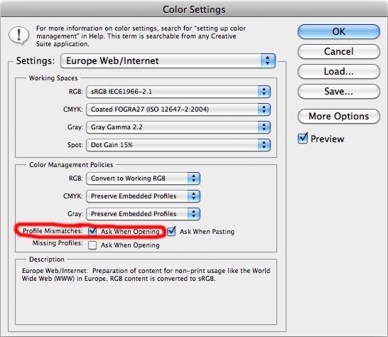
Sometimes in Settings at the top it says North America Web/Internet instead of Europe, but they're basically the same and selecting the web/internet option should change the second box down to sRGB (this is the important one). A very handy thing to do is select the box I've circled in red, and doing this will inform you if an image you're opening has a colour space embedded other than the 'working' one and will ask you if you want to convert it.
So onto the photos…
The first KLM 747 immediately looks to be quite dark in the mid tones and lacking highlight detail, and the histogram quickly shows this:
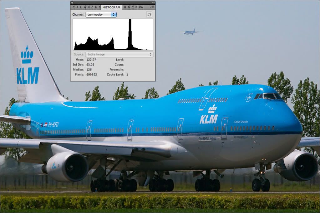
We can see most of the information in the histogram is over to the left side in the darker mid tones and shadows and there's very little to the right up in the highlights; the information isn't where we want it to be for a balanced photo, so we need to shift it around a bit. We could use Curves as we did in previous examples, but for this I'll actually use Levels which can sometimes be quicker and more convenient.
If we open the Levels box we see a histogram with three boxes underneath it, and these three boxes allow us to 'stretch' the information in the shadows, mids and highlights out. It's important to note that the histogram you see in Levels is an RGB histogram which means it's showing individual histograms for all three channels layered on top of one another; this is very different to the Luminosity histogram shown on the right which reads the combined output of all three channels and it's the Luminosity histogram we need to really pay the most attention to.
To understand what the numbers 0, 1.00 and 255 actually mean and what you're doing when adjusting them, it's handy to know a little bit about what actually happens inside your camera when you take a photo. The sensor in any digital camera is actually an analogue device very much like the photosensitive cells that power a solar calculator, the difference is that on a digital camera sensor these cells are microscopic and each has either a red, green or blue filter over it (this is how we get the three separate colour channels). As in the calculator, when photons hit these cells they generate a tiny electrical current but in the camera these electrical signals are then passed through an amplifier to make them bigger and easier to process (incidentally when cranking up the ISO it's these amplifiers we increase the gain of, and as with any amplifier, more gain means more noise and that's why we see more grain at higher sensitivities). Up until now your digital camera has actually been entirely analogue, it becomes digital at the next step when the amplified signals pass through an A/D converter and enter the digital world. If you shoot JPEG, after digitising the information is then compressed into the JPEG file recorded to your memory card and in an 8 bit JPEG basically each of the three colour channels is split into 256 equal increments ranging from 0 to 255, 0 being off and 255 being clipped (as discussed previously). Have you ever heard people say a computer screen or camera is capable of displaying 16.7 million colours? This 8 bit RGB information is why, because we have three channels each of which has 256 levels of brightness and therefore any combination within those channels will create a colour (or a shade of grey if the three channels are the same). So 256 x 256 x 256 = 16,777,216 colours.
Anyway… I'm rambling slightly so I'll get back to the point. From this you can see we have three channels ranging from 0 to 255, so hopefully you can now see what the numbers 0, 1.00 and 255 relate to when you see them in Levels. Let's adjust the highlights first. If we take the pointer on the right and start moving it to the right we can see the image gets brighter and the information in the luminosity histogram starts shifting to the right. This is because we're literally 'stretching' the limited information we have further up into the highlights. Doing this makes the gaps between those levels of brightness bigger which is another problem with editing and the main reason nailing exposure in the first place is so important, but nonetheless it shouldn't create a problem if done gently.
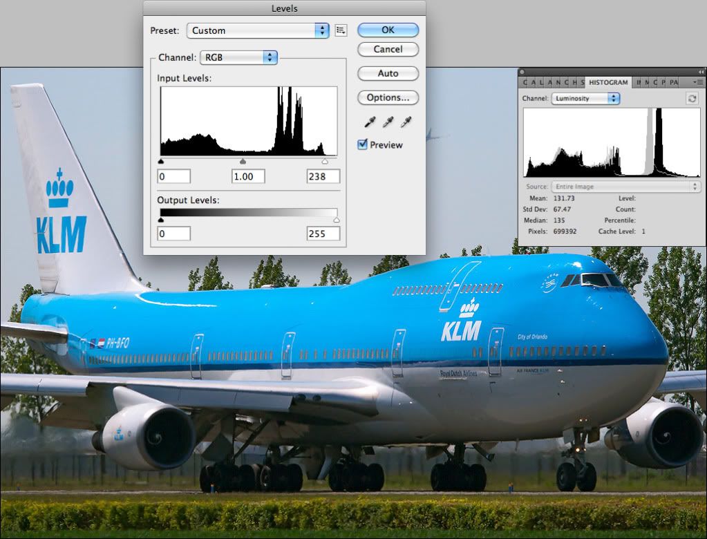
Shifting 255 to 238 brightens the highlights and gives us that information back to the right of the histogram, but the mid tones are still very dark and lacking detail so we'll now shift them to the right a bit by changing 1.00 to 1.35. Notice how much more balanced it looks and how much more detail there is under the aircraft? Also note how different the luminosity histogram looks with the mid tones shifted to the right.
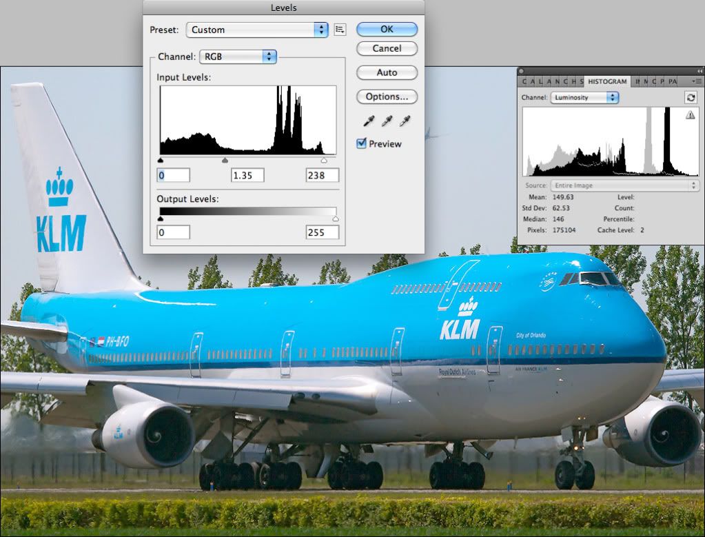
We're almost there but not quite… Can you now see the last thing we need to correct? Remember earlier I mentioned looking at the tyres to check how the shadows are looking? Because we've adjusted the mid tones the tyres and shadows in general don't look bold enough, and we can see this again in the histogram as there's a gap to the left. This is easily sorted by changing 0 to 4 or 5 and 'stretching' the shadow detail down to the left side of the histogram.
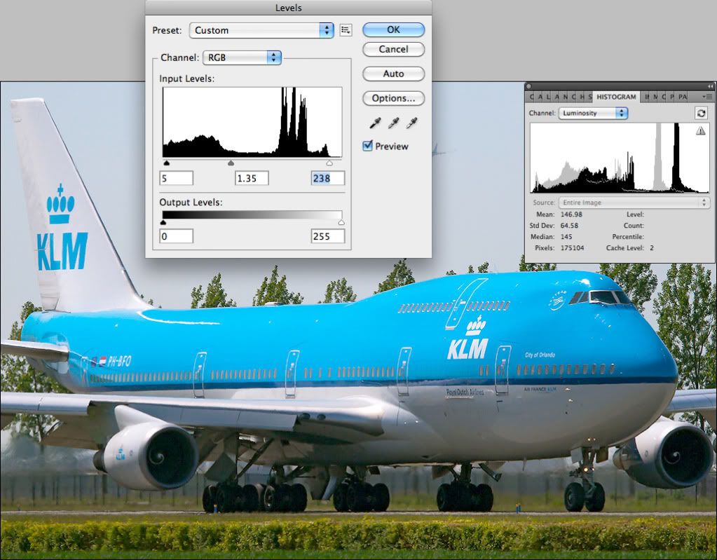
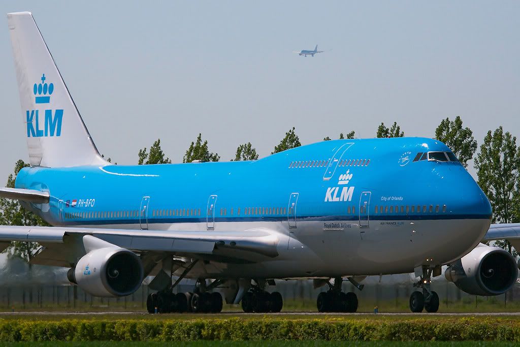
So, those three simple adjustment have taken this somewhat dull image:
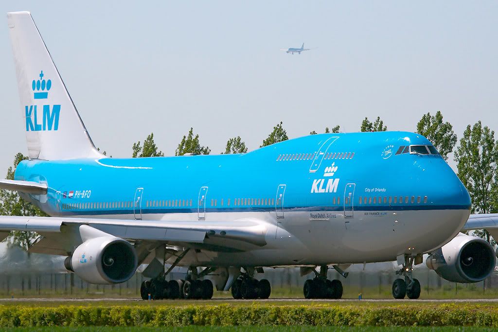
And transformed it into something much more vibrant and balanced (the shadows could probably still do with being a touch darker in places like the intake of engine No.3 but we can go into that another time!):
Every single step I've taken with these adjustments has been dictated purely by what the histogram is telling me. If I see a gap, I fill it (how wrong did that sound?!) It may sound strange, but for standard aviation photos the first few editing steps I make are done without even looking at the photo. I know that a gap to the left will lead to the shadows looking washed out and I know that a gap to the right generally means a dull and lifeless photo; this rarely changes if you're taking standard photos, so there's actually no real need to look at the photo for these adjustments. The histogram tells you everything you need to know (although obviously if it looks wrong then further adjustment is required. Regardless of what the histogram tells you the photo still has to look right).
I'll only go into that photo in detail because the same actually applies to the others, and using this as an example it should be possible to adjust the others. The only thing I'll say is try keep your eye open to spot all faults and not concentrate just on one or two. The second KLM shot is quite soft at the moment which you're probably aware of, but it's worth literally thinking 'look for other faults' when you're editing. It's very easy to be concentrating so much on editing one thing that you completely forget to check others (something I've certainly been guilty of in the past and still am occasionally), so as well as getting used to reading histograms and adjusting contrast/exposure accordingly, also still keep an eye out for sharpness, composition, things being level, colour casts, etc. We screen very much on a 'look for reasons to accept' basis rather than look for reasons to reject so the odd fault can be ignored, but it's always best to spot all faults and correct them if you can.
Hope that helps and again, just give me a shout if you need any further help.
Paul
Apologies for the late reply. Hookay, there's one very important thing I'll mention before looking at the photos themselves and that's the fact the colour space you're using is actually wrong. The colour space is the bit of the file that tells whatever you're viewing the image on how to render the colours, and if it's set incorrectly then nasty things can happen! There are generally two colour spaces digital cameras have the option to use, Adobe RGB and sRGB, and it's important to note that the internet works generally in sRGB (or rather, most internet browsers only recognise sRGB). The result is that an image uploaded with the Adobe RGB colour space embedded will appear undersaturated and lacking contrast on non-colour managed browsers like Internet Explorer. The major difference between the two is that Adobe RGB has a slightly wider gamut (range of colours) and can be better for printing, so people will sometimes shoot in Adobe RGB and then convert to sRGB when they upload to the internet. Using sRGB is still fine for printing, so if most of your work is web-based then it may be a good idea to set both your camera and editing software to sRGB. If you use Photoshop, this can be done by going to Edit - Colour Options:
Sometimes in Settings at the top it says North America Web/Internet instead of Europe, but they're basically the same and selecting the web/internet option should change the second box down to sRGB (this is the important one). A very handy thing to do is select the box I've circled in red, and doing this will inform you if an image you're opening has a colour space embedded other than the 'working' one and will ask you if you want to convert it.
So onto the photos…
The first KLM 747 immediately looks to be quite dark in the mid tones and lacking highlight detail, and the histogram quickly shows this:
We can see most of the information in the histogram is over to the left side in the darker mid tones and shadows and there's very little to the right up in the highlights; the information isn't where we want it to be for a balanced photo, so we need to shift it around a bit. We could use Curves as we did in previous examples, but for this I'll actually use Levels which can sometimes be quicker and more convenient.
If we open the Levels box we see a histogram with three boxes underneath it, and these three boxes allow us to 'stretch' the information in the shadows, mids and highlights out. It's important to note that the histogram you see in Levels is an RGB histogram which means it's showing individual histograms for all three channels layered on top of one another; this is very different to the Luminosity histogram shown on the right which reads the combined output of all three channels and it's the Luminosity histogram we need to really pay the most attention to.
To understand what the numbers 0, 1.00 and 255 actually mean and what you're doing when adjusting them, it's handy to know a little bit about what actually happens inside your camera when you take a photo. The sensor in any digital camera is actually an analogue device very much like the photosensitive cells that power a solar calculator, the difference is that on a digital camera sensor these cells are microscopic and each has either a red, green or blue filter over it (this is how we get the three separate colour channels). As in the calculator, when photons hit these cells they generate a tiny electrical current but in the camera these electrical signals are then passed through an amplifier to make them bigger and easier to process (incidentally when cranking up the ISO it's these amplifiers we increase the gain of, and as with any amplifier, more gain means more noise and that's why we see more grain at higher sensitivities). Up until now your digital camera has actually been entirely analogue, it becomes digital at the next step when the amplified signals pass through an A/D converter and enter the digital world. If you shoot JPEG, after digitising the information is then compressed into the JPEG file recorded to your memory card and in an 8 bit JPEG basically each of the three colour channels is split into 256 equal increments ranging from 0 to 255, 0 being off and 255 being clipped (as discussed previously). Have you ever heard people say a computer screen or camera is capable of displaying 16.7 million colours? This 8 bit RGB information is why, because we have three channels each of which has 256 levels of brightness and therefore any combination within those channels will create a colour (or a shade of grey if the three channels are the same). So 256 x 256 x 256 = 16,777,216 colours.
Anyway… I'm rambling slightly so I'll get back to the point. From this you can see we have three channels ranging from 0 to 255, so hopefully you can now see what the numbers 0, 1.00 and 255 relate to when you see them in Levels. Let's adjust the highlights first. If we take the pointer on the right and start moving it to the right we can see the image gets brighter and the information in the luminosity histogram starts shifting to the right. This is because we're literally 'stretching' the limited information we have further up into the highlights. Doing this makes the gaps between those levels of brightness bigger which is another problem with editing and the main reason nailing exposure in the first place is so important, but nonetheless it shouldn't create a problem if done gently.
Shifting 255 to 238 brightens the highlights and gives us that information back to the right of the histogram, but the mid tones are still very dark and lacking detail so we'll now shift them to the right a bit by changing 1.00 to 1.35. Notice how much more balanced it looks and how much more detail there is under the aircraft? Also note how different the luminosity histogram looks with the mid tones shifted to the right.
We're almost there but not quite… Can you now see the last thing we need to correct? Remember earlier I mentioned looking at the tyres to check how the shadows are looking? Because we've adjusted the mid tones the tyres and shadows in general don't look bold enough, and we can see this again in the histogram as there's a gap to the left. This is easily sorted by changing 0 to 4 or 5 and 'stretching' the shadow detail down to the left side of the histogram.
So, those three simple adjustment have taken this somewhat dull image:
And transformed it into something much more vibrant and balanced (the shadows could probably still do with being a touch darker in places like the intake of engine No.3 but we can go into that another time!):
Every single step I've taken with these adjustments has been dictated purely by what the histogram is telling me. If I see a gap, I fill it (how wrong did that sound?!) It may sound strange, but for standard aviation photos the first few editing steps I make are done without even looking at the photo. I know that a gap to the left will lead to the shadows looking washed out and I know that a gap to the right generally means a dull and lifeless photo; this rarely changes if you're taking standard photos, so there's actually no real need to look at the photo for these adjustments. The histogram tells you everything you need to know (although obviously if it looks wrong then further adjustment is required. Regardless of what the histogram tells you the photo still has to look right).
I'll only go into that photo in detail because the same actually applies to the others, and using this as an example it should be possible to adjust the others. The only thing I'll say is try keep your eye open to spot all faults and not concentrate just on one or two. The second KLM shot is quite soft at the moment which you're probably aware of, but it's worth literally thinking 'look for other faults' when you're editing. It's very easy to be concentrating so much on editing one thing that you completely forget to check others (something I've certainly been guilty of in the past and still am occasionally), so as well as getting used to reading histograms and adjusting contrast/exposure accordingly, also still keep an eye out for sharpness, composition, things being level, colour casts, etc. We screen very much on a 'look for reasons to accept' basis rather than look for reasons to reject so the odd fault can be ignored, but it's always best to spot all faults and correct them if you can.
Hope that helps and again, just give me a shout if you need any further help.
Paul


Comment