If this is your first visit, be sure to
check out the FAQ by clicking the
link above. You may have to register
before you can post: click the register link above to proceed. To start viewing messages,
select the forum that you want to visit from the selection below.
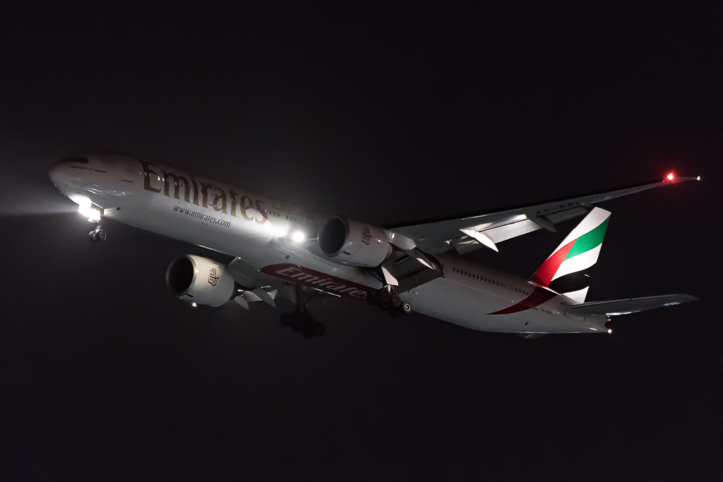
I am trying to take plane pictures at night.
It's a completely different game...
What's your opinion about these ones?
Does any of them stand any chance?
What could I improve?
I am trying to take plane pictures at night.
It's a completely different game...
What's your opinion about these ones?
Does any of them stand any chance?
What could I improve?
The same standards would apply as with any other more static night shot. I would watch out for blurriness and noise as being the biggest potential problems, but if you can avoid those, then there is no reason such images shouldn't stand a chance.
Dear,
I got some pictures rejected for too much or too little contrast.
And yes, I am unsure about the too much or too little...
It is said not to appeal and to discuss in the forum so here they are >
1.
2.
3.
4.
I would say too much for 1, 2 ?
Not enough for 3, 4 ?
Or am I wrong ?
Is there any trick to identify the too much or too little contrast in a picture ? How do the screeners assess this aspect ?
Dear,
I got some pictures rejected for too much or too little contrast.
And yes, I am unsure about the too much or too little...
It is said not to appeal and to discuss in the forum so here they are >
I would say too much for 1, 2 ?
Not enough for 3, 4 ?
Or am I wrong ?
Is there any trick to identify the too much or too little contrast in a picture ? How do the screeners assess this aspect ?
Thank you again
On all of them the aircraft looks a bit dull, lacking highlights and shadows, with a washed out background.
The easiest is to check the luminosity histogram. You will see, if the photo lacks shadows, mid tones or highlights, or if there is too much of it. There is a sticky topic somewhere in the forum about the use of the histogram.
Last edited by LX-A343; 2018-07-07, 07:48.
Reason: typo
Dear,
I got some pictures rejected for too much or too little contrast.
And yes, I am unsure about the too much or too little...
It is said not to appeal and to discuss in the forum so here they are >
I would say too much for 1, 2 ?
Not enough for 3, 4 ?
Or am I wrong ?
Is there any trick to identify the too much or too little contrast in a picture ? How do the screeners assess this aspect ?
Thank you again
I was just quickly editing one of your images to show what in effect Gerado has just said in the meantime. They lack contrast not showing the difference in the black/mids/whites - In essence quite 'flat'. Using your jpeg I adjusted contrast via 'curves' in PS (on the left) compared to what you posted (right) which shows how quickly you can deal with these going back to your original file(s). Obviously take more time than me but hopefully it demonstrates the point
cheers
T
[ATTACH=CONFIG]16766[/ATTACH]
Thank you so much for taking the time! Very instructive to me. So nice to get support from fellow photographers. High 5!
This plane was involved in an aborted take-off incident on 3 August 2018 after it attempted to take off from a taxiway. Engines can be seen in the thrust reversal position.
We process personal data about users of our site, through the use of cookies and other technologies, to deliver our services, personalize advertising, and to analyze site activity. We may share certain information about our users with our advertising and analytics partners. For additional details, refer to our Privacy Policy.
By clicking "I AGREE" below, you agree to our Privacy Policy and our personal data processing and cookie practices as described therein. You also acknowledge that this forum may be hosted outside your country and you consent to the collection, storage, and processing of your data in the country where this forum is hosted.
 Tweet
Tweet


Comment