 Tweet
Tweet
I disagree with the backlit, however the image as a whole is soft/blurry too. Always hard to get good in focused shots like that at a airshow.
-
-
Hi guys!
Just got this rejection back last week, and I'm being told that it's underexposed -- which I really don't think so...
Tried editing it a bit. If I increase the exposure any more, the nose area of the plane is going to blow out.
Thoughts? And thanks!
Comment
-
It's hard to make out the undercarriage from the bottom of the fuselage as it's a tad dark. Brightening the midtones a bit using levels (or ideally using curves) brightens up the underside of the aircraft without overexposing the nose area that you are worried about. I hope this helps some what.Originally posted by 9vska View Post
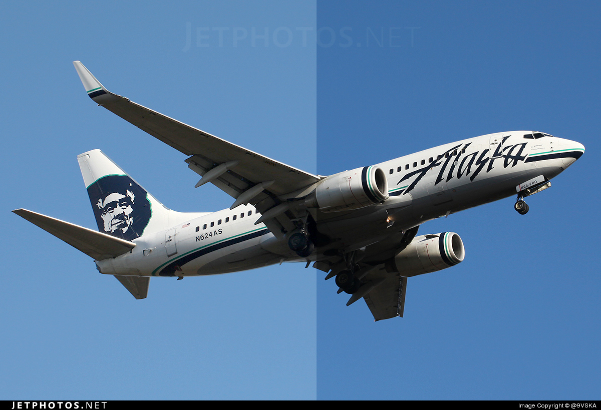
DaveComment
-
Originally posted by Mr Chips View Post
Right, midtones -- got it!
Fixed (I think) and resubmitted. Curves isn't really my thing, usually just play with levels (guess I'll need to broaden my horizons now!)
Thanks for your help, Dave!Comment
-
Midtones can also be adjusted on the histogram by moving the middle baseline arrow.If it 'ain't broken........ Don't try to mend it !
Comment
-
Just asking why a picture rejected fot "Halo" near the tail (http://www.jetphotos.net/viewreject_b.php?id=4140209), when halo has been corrected the picture became soft (http://www.jetphotos.net/viewreject_b.php?id=4148789). But I only removed the black halo near the tail (as a spot), the picture remained the same. Why not specify "soft" with the first rejection? It was told to me that screeners can't see previous reject of the same picture, but I read here the opposite!
However, may I try an appeal? Regards, piero.
Thank you for your answer, i really didn't understand the reason of backlit.Originally posted by Brenden S View Post
Again (for all screeners), if an uploader send an appeal with a well written reason, answering with "<<<" is not polite. Regards.Comment
-
The standards of screeners are clearly very different!
First off, I must agree with JunkieIT with the following remark:
Now, I’ve had screeners which would be very helpful in pointing out the problem in the initial rejection; I’ve had those who’d make a quick note in my appeal, although ultimately rejected; and there are these screeners who couldn’t be bothered to be courteous.Originally posted by JunkieIT View Post
I know screening can be a tedious task. But aren’t manners also?
Anyway, moving on, I previously posted a shot here and have received helpful advice on fixing it for re-screening -- and today, it got rejected again for more reasons than previous!
The shot in question: http://www.jetphotos.net//viewreject_b.php?id=4149829
I’m being told it’s still underexposed and too soft. The shot was fixed, and a fellow forum user also seconded the image as okay.
Two other shots were also rejected, previously only for underexposure, which has been fixed. These same shots, reprocessed, now gets four rejection reasons -- seriously, what gives!?
I am considering appealing, because this is just ridiculous (I’ve put in time and effort to make these shots as perfect as possible, only to be told by some screener that my shot actually has more problems that I was originally told during the previous screening process!)
On an end note, I would like to say (for the record) that some screeners are clearly using a different rule book when it comes to the job. Like the last two rejected shots above (i.e. the HX ones), if I’m told they are only underexposed, then why would my second rejection get more reasons listed -- when, logically, I have reprocessed the shot for the purpose of having it accepted, and therefore wouldn’t be making it *worse* and allowing the screener to have a go at me!
This isn’t just counterproductive, it’s discouraging and exceptionally annoying!Comment
-
Thanks for pointing that out, Brian!Originally posted by brianw999 View Post
I do realise that the middle arrow is for that, but I couldn�t seem to get it right for that particular image -- but the curves made it slightly easier and more flexible for me to do so.
Cheers.Comment
-
Air Canada looks like dark, and too much contrast.
Both airbus photos are blurry and also oversharpened. Sometimes we miss rejection reasons by accident. Remember we are all humans and are not perfect. You are also dealing with a multi cultural screening team too.Comment
-
Originally posted by Brenden S View Post
I appreciate your response, Brenden.
Your points are taken. But how about the screeners try to be a bit more congruent in terms of screening standards? I�m pretty sure my kind of situation happens a lot -- and if you were on the same end of the stick as me, you�d be pretty annoyed too.
Regarding the AC shot, I�ve been told on this forum that the shot is okay, which is why I submitted it (I don�t want to waste anyone�s time, including my own!) It being �dark� is only a matter of personal opinion, given how the shot was taken at dusk.
Can�t win.Comment
-
It's a gray zone I suppose. According to the curves, the exposure was fine. This was the reason I said it looked OK. If I were one of the screeners for that particular photo, I would have accepted it. I think the post-processing is about as good as it gets, considering the light conditions.Originally posted by 9vska View PostComment
-
Reject Opinion
Hi Everyone,
I was quite surprised to receive a reject on this
especially since it was a sunrise/sunset mood light which in itself is quite dim, moreover being shot at night during a flight.
Can you kindly share your opinion on bettering the quality?
Appreciate all feedback,
TIA,
Regards,
Girish BComment
-
@jetsetgb
well for me it lokks a little bit soft, not a lot. Dark??? Hmm!!!!
I got this one rejected with:
Over Processed / Bad postprocessing
and one of my favourits rejections
Too much or too little contrast
is it now too much or too little ???
Comment
-
To me it needs some more contrast, and it looks like the plane is a bit high in the frame, look at the amount of space at the top of the image above the tail compared to the amount of space at the bottom below the landing gear.Originally posted by Soaring1972 View PostComment
-
It should have also been rejected for being Backlit too.Comment

Comment